UX 404: The Mysterious Water Tap
When I first visited a friend of mine at his place we had a lovely dinner of salmon and rice, making it a full protein-packed meal.
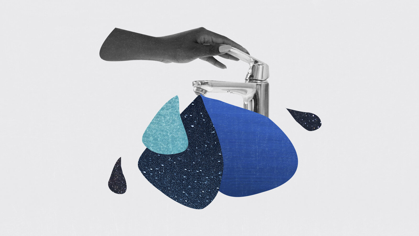
At some point I got thirsty and wanted to get myself a glass of tap water.
‘’I’ll get it’’, I said as he was about to get up.
However, once I wanted to pour some water from the tap in the glass I was holding beneath it, it didn’t exactly work the way I’d imagined it would.
I pressed it upwards like I would do with any similar-looking water tap, but couldn’t lift the handle. Stubbornly, relying on my past experiences, I tried again. After the third attempt I ended up getting really annoyed because I couldn’t figure out what was going on and what was I doing wrong.
I felt stupid. Performing a simple action like this should have been a no-brainer.
[embed]https://youtu.be/8IubSOB4I88[/embed]
My friend noticed that I was struggling and said ‘’Push it down!’’. That did it. My glass was filling up quickly. I was relieved and confused at the same time.
‘’What kind of a tap is this?’’, I asked in disbelief.
‘’Everyone ends up almost smashing it’’, he answered.
I was intrigued.
What was the purpose of this design?
I thought about other things that have a similar way of being used. We push down the pump of the soap dispenser to make the soap get out, true. But even a hand water pump first needs to get the handle lifted in order to push the water once the handle gets forcefully pressed down.
There are many different water taps and some of them have distinct shapes that indicate a different way of using them.
There are the ones that are sensitive to movement, the ones that have a ‘’button’’ that needs to be pushed down and the ones that have the usual levers that need to be rotated.
This tap and the thinking behind it still remains a mystery to me. On one hand, I understand that it could be useful to tap it downwards like we do with the soap dispenser, but since it is a very ordinary-looking object I would assume that it would work in what I consider to be an ordinary way too.
Once again, this case proves how much we rely on things performing a certain action by the way they look and how we are shaped by our habits and experiences.
We learn as we go and things that are now ‘’intuitive’’ wouldn’t have been so a a couple of decades ago (like phone apps), but at the end of the day design shouldn’t let users feel incapable, stupid or confused.


